Adapted from my 2018 Ignite Talk

For most people in the tech world, life can be fairly drab They sit in cubicles, at insurance companies, writing code, designing their millionth, mind numbing button, or making cold calls to hostile schmucks all day. It’s a job right? Something you have to be paid to do, because no one in their right mind would do this for free.

On the other hand, we have the guys in Silicone Valley, wrapped in hoodies and self righteousness, planning on getting rich and changing the world (not necessarily in that order). But how do you get from cubicle to your dream? Working on what you love?

“I’m never doing this again”

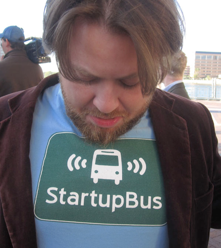
I would like to tell you about one the best dumb ideas of recent history: The StartupBus. A Navy Seal boot-camp training program for tech entrepreneurs. Or so I like to think.

In 2010, my friend Elias, was working in Venture Capital, and wanted to get a bus with a bunch of friends and go to South by South West – the huge film, music and tech conference in Austin. He thought would be funny to semi-mock Startup Culture in Silicon Valley by having everyone on the bus try and build a tech startup in the three days it would take to get there from San Francisco.

It sounded crazy to everyone, but they all had so much fun, that a group of them decided to turn it into a “my-city-is-better-than-your-city” tournament the following year. They all went back to their respective states, and started recruiting riders for a full-blown competition. 

The format is simple: 30 strangers get selected to get on a bus, as long as they are extremely competent and fall into one of three clichéd categories: Hipsters Hackers, and Hustlers: Graphic designers, Computer programmers, and Marketing and Business Development people.

They then get on the bus day one, introduce themselves, and pitch an idea for a startup. Groups then form around the ideas, and then the teams work like crazy, for three or four days, to make an actual business. With REAL products, and even Customers – In three days!

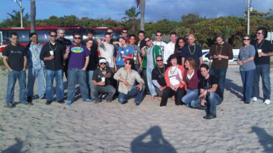
I was first invited to ride the 2011 Miami bus. I worked on two separate teams, competed against 10 other busses, 60 other teams,  and didn’t sleep for four days, and met some of the most amazing people that are still in my life to this day.

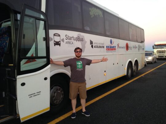
Since then, the competition has grown. There are more and more busses every year from more cities, a separate European competition, and I’ve recently gotten back from the inaugural StartupBus Africa trip, which was epic! But why would anyone do this?

Well, most people are just… terrible at their jobs. I assume you’ve found this yourself. But the bus is different. The sheer caliber of the people you meet if off the charts. Everyone works so hard, and is so good at what they do, that there is a feedback loop of inspiration; You WANT to work harder to show that you belong. 

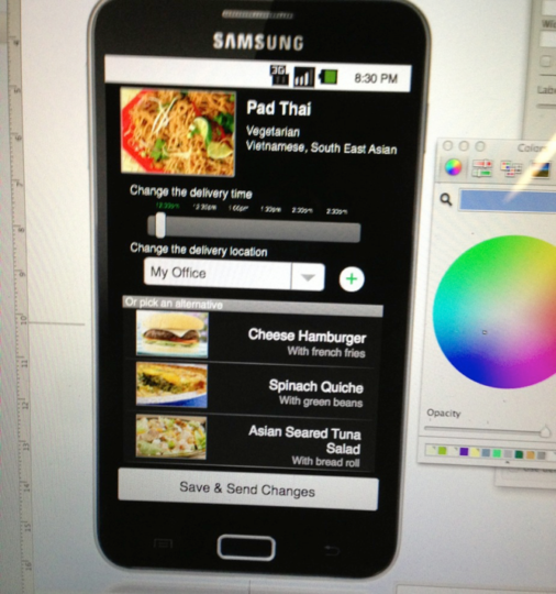
The result is productivity to an extent not seen in the real world. What can you create on a bus in three days? How about a fully fledged, artificial intelligence food ordering system that will automatically order you lunch every day? Yeah, we did that. 

Nomscription – Built in three days. On a bus.

Internet free chat system for disaster areas? Yup. A career matching system for Veterans? Check. Customized cereal delivered to your door? Yup. A full social network for selling what you grow in your back garden – a team from Tampa built that!

And there are hundreds of others. But the bus isn’t all flowers and roses. In fact it is totally awful. And that is one of the reasons it’s so successful. If you can build something amazing in three days next to a chemical toilet, you can do anything.

There is bad food, motion sickness, team melt downs, spotty power and internet access, and every new hell you’d find in a real startup, but compressed into the equivalent of a long weekend.  As a result, you learn to be flexible, to deal with the chaos, and to thrive.

Then there is the physical side.  Try having a normal conversation after writing code for ten hours doing this. Also, after four days without sleep, you can have some pretty inspiring insights, as well as some mind-blowing hallucinations. Not to mention all the caffeine and alcohol.

The pure squalor of the situation, combined with the amazing team work that goes on, binds you so closely to those people, that you instantly have 30 new best friends. I started referring to the processes as entrepreneurial Stockholm Syndrome. 

But the process opens your eyes. A passionate, five person team, working 16 hour days, for four days straight, produce 320 hours of actual work. That’s an equivalent 40 work days of super productivity. 

If you can build a complete product, create marketing materials, pitch decks, business cards, have customers and sales, etc., all in three days, ON A BUS, what could you do if you gave yourself six months?

I bet that you’re pretty amazing. You just can’t begin to realize how freaking amazing you REALLY ARE until you’ve HAD be amazing waste deep in crap and sleep depravation. There are no excuses. Go and build something, right now!

Previous ArticleNext Article
I help companies turn their technical ideas into reality.

CEO @Sourcetoad and @OnDeck

Founder of Thankscrate and Data and Sons

Author of Herding Cats and Coders

Fan of judo, squash, whiskey, aggressive inline, and temperamental British sports cars.

Leave a Reply

Image generation comparison from February 2026

I spend a lot of time generating images these days for presentations. My typical workflow is fairly scientific: I ask Midjourney to produce a relatively cute image of a frog, a toad, a robot, or some other vaguely anthropomorphic creature doing something related to the slide I’m about to present.

Once I get the image, I expand the background by about 90% so the character ends up in the corner of the slide. That gives me a nice, relatively clean area to drop text on top. Sometimes I use Photoshop to do the expansion. Sometimes Midjourney cooperates. ChatGPT is actually pretty good at this too. Nano Banana is… enthusiastic. It tends to try a little too hard right now.

That’s fun and all. But the more interesting comparison isn’t cute amphibians. It’s boring enterprise diagrams.

Recently I had to generate some architecture visuals for an RFP response. Rather than suffer alone, I decided to turn it into a model comparison experiment.

Below is a slightly simplified (but very real-feeling) prompt I used. The company is fictional. The buzzwords are not:

Create a clean, executive-level architecture diagram titled “Closed-Loop Member Intelligence Platform.”

The layout should be 16:9 and structured left to right with a circular optimization loop surrounding the system.

On the left side, show multiple member touchpoints feeding into the platform:
- Website (class browsing, account login)
- Mobile App (workout tracking, push notifications)
- In-Club Kiosks (check-in terminals)
- Wearable Device Integrations (fitness trackers)

Label this section: “Member Interactions Across Digital & Physical Channels.”

All touchpoints should flow into a large central hub labeled:

“Unified Member Profile & Real-Time Event Engine”

Inside the central hub, include:

- Web SDK
- Mobile SDK
- API Gateway
- Event Streaming Layer
- Clickstream Data Capture
- CRM Data Sync
- Identity Resolution Engine

Include a small sub-caption:
“Event-level data unifies anonymous visitors and active members into a single dynamic profile.”

From the central hub, arrows should flow to a right-side activation layer labeled:

“Real-Time Engagement & Orchestration”

Include these outputs:

- Personalized Workout Recommendations
- Dynamic Class Availability Messaging
- Triggered Retention Offers
- Membership Upgrade Campaigns
- A/B Testing & Experimentation Engine

Surround the entire diagram with a circular arrow labeled:

“Continuous Optimization & Revenue Growth”

Along the circular loop, include metrics:

- Engagement
- Conversion
- Retention
- Lifetime Value

Design style should be modern, minimal, and suitable for an enterprise SaaS presentation.
Use neutral tones with one accent color to indicate data flow.
Avoid clutter.
Make the architecture clear and readable for both technical and executive audiences.

Here are the results.

ChatGPT

Clear winner for “looks like a human consultant made this at 11:30 p.m. before a board meeting.” The text was incredibly legible. The layout was balanced. The hierarchy made sense. It genuinely looked like something you’d expect in a mid-market SaaS pitch deck.

I even did a reverse image search on some of the icons. No exact matches. That suggests they were generated rather than assembled from some common icon pack. Which is pretty cool.

Claude

Claude did something interesting. Instead of just giving me a static diagram, it generated a React application that rendered the architecture visually inside its canvas. I should have guessed this is what that nerd would do… in fact I did guess, but whatever.

That has upsides. I can tweak the code. I can modify the layout. I can version control it. That’s appealing to the nerd in me.

But technically it failed the homework assignent. It wasn’t what I asked for. I asked for a diagram image. What I got was a React app that displayed a diagram that I had to screenshot.

That said, I actually liked the aesthetic. It felt a little more “me.” Slightly less textbook. Slightly more product-thinking.

Gemini (Nano Banana)

The undisputed champion of 2026 in image generation, nano banana, was actually my least favorite of all of the designs. I think there’s something really weird about the arrows on the outside ring of this diagram. Why are there two arrows between “Engagement” and “Conversion”? Why are they different sizes? I did actually find a couple of exact matches when searching for some of these icons here, so so there might be some assembly on top of generation going here, but I cannot tell because these icons are so universal that it’s likely that that could just be a coincidence.

Midjourney

Ah, Midjourney. My current favorite for keynote frogs.

Completely and utterly useless for generating readable diagrams.

It’s phenomenal at stylized imagery. I’ve tuned it so much over time that it practically knows my aesthetic preferences better than I do. It’s like it’s been trained specifically to make amphibians that align with my personality.

The Omni feature (object permanence) is genuinely impressive. If you’re telling a visual story and need a character to look consistent across multiple scenes, or you’re creating a children’s book to convince your six-year-old that haircuts are not a violation of human rights, it’s fantastic.

But enterprise architecture diagrams? Nope, sucksville.

Wrapping Up

I was pretty sure that nano banana was going to run away with this one. Everyone I know works in banking or finance or medicine has been telling me how great the model is for generating diagrams and process flows. They’ve been raving about how things that were not possible three months ago are now completely durable with this model. It was a little bit of a surprise to see that my personal favorite was good old-fashioned ChatGPT. I think, for my personal use, I’m probably going to use Claude to generate diagrams because they’re a lot easier for me to tweak once they’ve been generated.

That said, I think this experiment showed that when I do this kind of work in the future, I’m just going to load up the same prompt in three different models and just pick the one I like the most. Some of it’s going to be personal tastes; some of it’s going to be how well the model interpreted the prompt, and some of it’s going to be the state of that particular LLM and its model on that given week.

And I’m going to stick to only using Midjourney for generating cute pictures of toads.