In Part 1, I talked about who comes to our offsites, when we run them, and why a good pickleball court is almost as important as a good agenda. Now let’s get into what actually happens once everyone is in the room (or in the pool).
This is the part I had to learn the hard way. Running strategy sessions is a bit like cooking spaghetti… looks simple, but if you don’t time it right, everything gets mushy. After years of trial and error, I’ve found a rhythm that makes these sessions productive without turning into corporate torture. This is in no way an exhaustive guide, and I still intend to get better at this, but hopefully someone will find this useful.
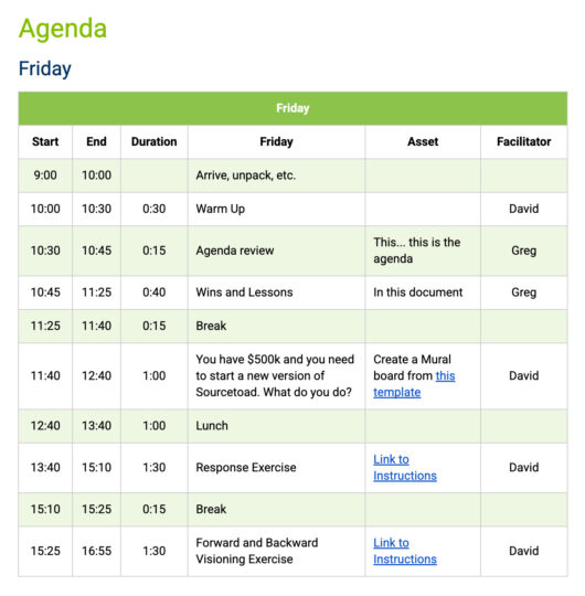
The Agenda Book
When everyone arrives, they get an agenda book, printed out on beautiful standard office paper, and lovingly stapled in the top corner. It also comes in a fancy digital version. In fact, they usually see it a few days before the offsite so they know what’s coming. But this isn’t like getting assigned homework. I don’t ask anyone to prepare long presentations or status updates. We’re not here to listen to two hours of “how marketing is doing.”
Instead, the agenda is designed to focus us on the big questions. It always includes a warm-up to get people thinking, breaks every two hours (because no one does good strategy work with a full bladder), and a quick refresher on what we actually mean by “strategy.”
I’ve uploaded a template version of my Agenda Book for you in case you find it useful.
So… What Is Strategy
Here’s how I break it down in plain English (when I say “I” I mean mainly what I learned from Richard Rumelt’s excellent book “Good Strategy/Bad Strategy“:
- Diagnosis. What’s the challenge we’re really facing?
- Guiding Policy. What’s our overall approach to deal with it?
- Coherent Actions. What are the specific things we’ll do to carry out that policy?
Or, to put it more simply: what game do we want to play, and how do we make sure it’s one we can win? If you haven’t heard this before, watch Robert Martin’s video on “A Plan is Not a Strategy“.
I also always remind my team of our company’s purpose, who we serve, our long-term goals, and our value proposition. Without those reminders, it’s too easy to drift into a “wouldn’t it be cool if…” brainstorm that has nothing to do with what we actually do.
Lessons and Successes
Every offsite starts with a “lessons and successes” session. Everyone writes down what went really well last quarter and what didn’t. But we don’t call them failures. We call them lessons or opportunities. It’s a small linguistic trick that makes people a lot more open about sharing. Somehow, no one wants to talk about failures, but everyone is happy to share a lesson. Go figure.
The Art of Session Timing
The timing of your sessions matters just as much as what you’re talking about. Here are a few rules of thumb I’ve learned:
- Avoid the first week of January. People are still mentally on the beach.
- Do the most creative sessions at 10 a.m. That’s the sweet spot between being awake and not yet hungry. Your team’s biological systems may differ.
- After lunch = process-driven work. Digestion is the enemy of innovation. You can still work while eating, but keep those conversations more about softer subjects (how to handle one on ones, time off policies, annual parties, etc.)
- End around 4:30 p.m. It gives people time to wind down before dinner and leaves wiggle room if you run over.
- Plan for things to go off schedule. There will be times when the group is on to something, and you (or hopefully your facilitator) can give them that space to breathe. So you need to plan this time into your agenda.
- Always define your terms. Even the obvious ones. Trust me, “everyone knows what that means” usually translates to “everyone has a slightly different definition.” Maybe have a little glossary where you say “OKRs: Objectives and Key Results” or something, and you can have it grow.
- Never plan your agenda in Word or Google Docs. Use a tool like Miro. Moving around digital Post-its is a lot easier than trying to force an agenda into table. You probably have groups of ideas that either need to be spread out through the offsite, or logically follow other sessions. Having this be fluid is much easier.
Exercises That Actually Work
Here are a few of the exercises we’ve used over the years that can spark insight (and sometimes recurring jokes that last for years about moths… ask me sometime).
- Wins and Lessons from the last quarter.
- The $500,000 Startup Challenge: “You’ve got half a million to launch a new version of our business. What do you build?”
- Forward and Backward Visioning: Picture three years in the future, then reverse-engineer how we got there.
- Personal Three-Year Visions: Where do you want to be, professionally and personally?
- OKR Realignment: Are our objectives actually aligned to strategy, or just busywork in disguise?
- Values and Behavior Mapping: How do our values show up in real life, and where do they fall short?
- Cultural Story Mapping: What stories define us, and what new ones should we be telling?
- Weird Rules Creation: The sillier, the better. Think: “No big decisions without snacks.” These often end up reinforcing culture more than you’d expect. (Stolen from What You Do Is Who You Are: How to Create Your Business Culture by the brilliant, but increasingly strange Ben Horowitz).
Sometimes things do get very tactical, like “how do we estimate better” or “what should the customer experience feel like at every touchpoint.” The point is to mix the big-picture, the personal, and the practical.
Facilitator or DIY?
For our big three-day Q4 offsite, I work with a professional facilitator. About six weeks before, we start planning the sessions. He drafts exercises, I give feedback, we go back and forth a couple of times, and by the time he arrives, everything is mapped out. During the offsite, he runs most of the sessions, and I step in to lead a few. If you’re going to do this properly, you have to get a professional facilitator. There is no way you can participate and facilitate at the same time. If you want the contact information of our fantastic facilitator, just contact me and I’ll introduce you.
For the one-day offsites, I handle it myself. It’s leaner, but the same principles apply. I still use Miro boards and agenda docs with links so no one has to ask, “Where’s the link again?”
Wrapping It All Up
At the end of each day, we set aside time to reflect and capture action items. On Sunday at the Q4 offsite, we do a quick survey for the facilitator, then finish with a wrap-up where we turn the best ideas into concrete action items or OKRs.
After that, it’s back to the pool, pickleball, or Mario Kart, and whiskey. Sometimes all combined.
Final Thoughts
The trick to a great offsite is balancing focus with fun. If it’s all play, you come back with nothing but a hangover and embarrassing photos of some executive who should not have eaten that gummy (or one that accidentally ate a moth!) If it’s all work, you come back exhausted and not wanting to go back to work. The sweet spot is somewhere in the middle: a weekend of clear strategy, honest reflection, and bragging rights to the late-night Nintendo battles. But the true indicator that you’ve pulled it off is that your team are excited to get back to work on Monday.
That balance is what keeps our team aligned, resilient, and ready for whatever the next quarter throws at us.