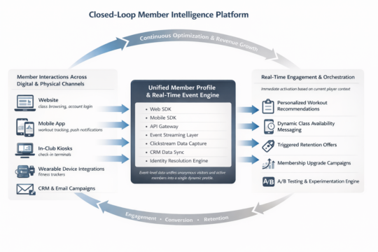
A brief exploration of the radical differences in contract software engineering quotes.

Software companies are everywhere these days. If you add in the number of freelancers on contractor sites, craigslist, or the guy your friend knows, they are like grains of sand on the beaches. And they all get the same question every day: “How much would it cost to build an app?”

This is a question that has been addressed on a thousand blog posts, mainly by frustrated engineering firms who struggle to understand how people can ask such a question. They give answers like, “How long is a piece of string?” or “How much does a house cost to build?” These examples are designed to show that the cost of something custom varies wildly based on what the specification is. This, however, is only the most surface level answer to that question. The real cost multiplier, and the hardest part to explain and quantify, is quality.

Quality of development is not simply a measure of your experience (e.g., How nice were your agency’s offices? Did they perform frequent check-ins? Did you feel good about the process? etc.). I’m talking about the actual quality of the code itself – not just the final product’s look-and-feel.

If you are paying a lot of money (relatively speaking) for a custom built application, it should be obvious that it was made with a thoughtful user experience and appropriate graphic design, while not throwing errors or leading to dead ends. Right? Unfortunately no. Even though this should be the bare minimum, getting the basics handled correctly is rare in my experience. As sad as that is, these signs of quality are something that you can shop for. You should be able to see examples of your potential agencies’ previous work or of your freelancer’s portfolio. But you need to test them in real life, as if you were a real user, before committing. Do not believe anything you see in a PowerPoint presentation.

The biggest difference in software design company prices is the quality you don’t see. These are the tougher to articulate items. What I’m talking about here is the commitment to engineering best practices and processes, the quality of the code, and the thinking behind that code.

A decent developer can build many of the same applications that a great developer can – especially your typical business software system. It might even take the two teams the same amount of time to complete the same project. And the apps might be indistinguishable when they launch. Great code, a real belief in process and best practices, and solid team management is not as apparent in the first iteration of a product, but it becomes glaringly obvious in later releases.

As a product matures, new features are added, interactions with other systems are required, and user bases grow in size. These three fundamental points are rarely considered by your average development firm or freelancer.

When you add new features to a piece of software, you will often need to change the database structure or the APIs of the original design. These can result in large scale, breaking changes; meaning updates will break previous versions of the application. This type of work often requires huge time commitments to testing the new versions, providing triggers and fail-safes for existing users, and of course writing all new code. Top class developers on the other hand design their systems from the get go to be extensible. They plan multiple API versions from day one, have contingencies in place for breaking changes at inception. They may have already built your system to be multilingual (even though it is only launching in one language) because they know it would be a huge undertaking to add on later. They will take into account accessibility standards, security, and data optimization.

The ability to interact with systems outside of the application’s native environment is another frequently overlooked engineering problem. Abstracting your APIs with middleware might take an extra day or two at the beginning of your design process, but it might save you months of work down the line when you want to change out a data provider. Documenting the process as you go along, explaining to future developers how this should work, is easy when you’re building it. It becomes a huge task of reverse engineering if you have to do it a year later.

Finally, we should talk about scalability. A well-designed system will have architectural structures in place that are designed to expand or to leverage scalable hardware systems, while balancing the long-term costs of growing. A lesser development firm will have a “cross that bridge when we come to it” attitude or will throw expensive additional monthly hardware costs at a problem that could have easily been avoided in the design process.

Conclusion

The problem with picking a software engineering firm is that they are not going to bore you with the details of their documentation process in the sales pitch. I haven’t even touched on things like automated testing of code, good relationships with distribution partners, well qualified project managers, and penetration testing as a standard practice. The problem is that almost no one is going to include these invisible quality requirements into a specification they put out for bid. Yet, these are the strongest determining factors in the long-term success of any software project. I promise.

Your options are to have a really solid technical lead on your team to evaluate the work being done or to pick a company that does go into these details in their sales pitch. You should be aware that doing things the right way is going to cost more up front, but it will save you double or even triple the time in the future if you do it the wrong way.

Previous ArticleNext Article
I help companies turn their technical ideas into reality.

CEO @Sourcetoad and @OnDeck

Founder of Thankscrate and Data and Sons

Author of Herding Cats and Coders

Fan of judo, squash, whiskey, aggressive inline, and temperamental British sports cars.

Image generation comparison from February 2026

I spend a lot of time generating images these days for presentations. My typical workflow is fairly scientific: I ask Midjourney to produce a relatively cute image of a frog, a toad, a robot, or some other vaguely anthropomorphic creature doing something related to the slide I’m about to present.

Once I get the image, I expand the background by about 90% so the character ends up in the corner of the slide. That gives me a nice, relatively clean area to drop text on top. Sometimes I use Photoshop to do the expansion. Sometimes Midjourney cooperates. ChatGPT is actually pretty good at this too. Nano Banana is… enthusiastic. It tends to try a little too hard right now.

That’s fun and all. But the more interesting comparison isn’t cute amphibians. It’s boring enterprise diagrams.

Recently I had to generate some architecture visuals for an RFP response. Rather than suffer alone, I decided to turn it into a model comparison experiment.

Below is a slightly simplified (but very real-feeling) prompt I used. The company is fictional. The buzzwords are not:

Create a clean, executive-level architecture diagram titled “Closed-Loop Member Intelligence Platform.”

The layout should be 16:9 and structured left to right with a circular optimization loop surrounding the system.

On the left side, show multiple member touchpoints feeding into the platform:
- Website (class browsing, account login)
- Mobile App (workout tracking, push notifications)
- In-Club Kiosks (check-in terminals)
- Wearable Device Integrations (fitness trackers)

Label this section: “Member Interactions Across Digital & Physical Channels.”

All touchpoints should flow into a large central hub labeled:

“Unified Member Profile & Real-Time Event Engine”

Inside the central hub, include:

- Web SDK
- Mobile SDK
- API Gateway
- Event Streaming Layer
- Clickstream Data Capture
- CRM Data Sync
- Identity Resolution Engine

Include a small sub-caption:
“Event-level data unifies anonymous visitors and active members into a single dynamic profile.”

From the central hub, arrows should flow to a right-side activation layer labeled:

“Real-Time Engagement & Orchestration”

Include these outputs:

- Personalized Workout Recommendations
- Dynamic Class Availability Messaging
- Triggered Retention Offers
- Membership Upgrade Campaigns
- A/B Testing & Experimentation Engine

Surround the entire diagram with a circular arrow labeled:

“Continuous Optimization & Revenue Growth”

Along the circular loop, include metrics:

- Engagement
- Conversion
- Retention
- Lifetime Value

Design style should be modern, minimal, and suitable for an enterprise SaaS presentation.
Use neutral tones with one accent color to indicate data flow.
Avoid clutter.
Make the architecture clear and readable for both technical and executive audiences.

Here are the results.

ChatGPT

Clear winner for “looks like a human consultant made this at 11:30 p.m. before a board meeting.” The text was incredibly legible. The layout was balanced. The hierarchy made sense. It genuinely looked like something you’d expect in a mid-market SaaS pitch deck.

I even did a reverse image search on some of the icons. No exact matches. That suggests they were generated rather than assembled from some common icon pack. Which is pretty cool.

Claude

Claude did something interesting. Instead of just giving me a static diagram, it generated a React application that rendered the architecture visually inside its canvas. I should have guessed this is what that nerd would do… in fact I did guess, but whatever.

That has upsides. I can tweak the code. I can modify the layout. I can version control it. That’s appealing to the nerd in me.

But technically it failed the homework assignent. It wasn’t what I asked for. I asked for a diagram image. What I got was a React app that displayed a diagram that I had to screenshot.

That said, I actually liked the aesthetic. It felt a little more “me.” Slightly less textbook. Slightly more product-thinking.

Gemini (Nano Banana)

The undisputed champion of 2026 in image generation, nano banana, was actually my least favorite of all of the designs. I think there’s something really weird about the arrows on the outside ring of this diagram. Why are there two arrows between “Engagement” and “Conversion”? Why are they different sizes? I did actually find a couple of exact matches when searching for some of these icons here, so so there might be some assembly on top of generation going here, but I cannot tell because these icons are so universal that it’s likely that that could just be a coincidence.

Midjourney

Ah, Midjourney. My current favorite for keynote frogs.

Completely and utterly useless for generating readable diagrams.

It’s phenomenal at stylized imagery. I’ve tuned it so much over time that it practically knows my aesthetic preferences better than I do. It’s like it’s been trained specifically to make amphibians that align with my personality.

The Omni feature (object permanence) is genuinely impressive. If you’re telling a visual story and need a character to look consistent across multiple scenes, or you’re creating a children’s book to convince your six-year-old that haircuts are not a violation of human rights, it’s fantastic.

But enterprise architecture diagrams? Nope, sucksville.

Wrapping Up

I was pretty sure that nano banana was going to run away with this one. Everyone I know works in banking or finance or medicine has been telling me how great the model is for generating diagrams and process flows. They’ve been raving about how things that were not possible three months ago are now completely durable with this model. It was a little bit of a surprise to see that my personal favorite was good old-fashioned ChatGPT. I think, for my personal use, I’m probably going to use Claude to generate diagrams because they’re a lot easier for me to tweak once they’ve been generated.

That said, I think this experiment showed that when I do this kind of work in the future, I’m just going to load up the same prompt in three different models and just pick the one I like the most. Some of it’s going to be personal tastes; some of it’s going to be how well the model interpreted the prompt, and some of it’s going to be the state of that particular LLM and its model on that given week.

And I’m going to stick to only using Midjourney for generating cute pictures of toads.