I spend a lot of time generating images these days for presentations. My typical workflow is fairly scientific: I ask Midjourney to produce a relatively cute image of a frog, a toad, a robot, or some other vaguely anthropomorphic creature doing something related to the slide I’m about to present.
Once I get the image, I expand the background by about 90% so the character ends up in the corner of the slide. That gives me a nice, relatively clean area to drop text on top. Sometimes I use Photoshop to do the expansion. Sometimes Midjourney cooperates. ChatGPT is actually pretty good at this too. Nano Banana is… enthusiastic. It tends to try a little too hard right now.
That’s fun and all. But the more interesting comparison isn’t cute amphibians. It’s boring enterprise diagrams.
Recently I had to generate some architecture visuals for an RFP response. Rather than suffer alone, I decided to turn it into a model comparison experiment.
Below is a slightly simplified (but very real-feeling) prompt I used. The company is fictional. The buzzwords are not:
Create a clean, executive-level architecture diagram titled “Closed-Loop Member Intelligence Platform.”

The layout should be 16:9 and structured left to right with a circular optimization loop surrounding the system.

On the left side, show multiple member touchpoints feeding into the platform:
- Website (class browsing, account login)
- Mobile App (workout tracking, push notifications)
- In-Club Kiosks (check-in terminals)
- Wearable Device Integrations (fitness trackers)

Label this section: “Member Interactions Across Digital & Physical Channels.”

All touchpoints should flow into a large central hub labeled:

“Unified Member Profile & Real-Time Event Engine”

Inside the central hub, include:

- Web SDK
- Mobile SDK
- API Gateway
- Event Streaming Layer
- Clickstream Data Capture
- CRM Data Sync
- Identity Resolution Engine

Include a small sub-caption:
“Event-level data unifies anonymous visitors and active members into a single dynamic profile.”

From the central hub, arrows should flow to a right-side activation layer labeled:

“Real-Time Engagement & Orchestration”

Include these outputs:

- Personalized Workout Recommendations
- Dynamic Class Availability Messaging
- Triggered Retention Offers
- Membership Upgrade Campaigns
- A/B Testing & Experimentation Engine

Surround the entire diagram with a circular arrow labeled:

“Continuous Optimization & Revenue Growth”

Along the circular loop, include metrics:

- Engagement
- Conversion
- Retention
- Lifetime Value

Design style should be modern, minimal, and suitable for an enterprise SaaS presentation.
Use neutral tones with one accent color to indicate data flow.
Avoid clutter.
Make the architecture clear and readable for both technical and executive audiences.
Here are the results.
ChatGPT
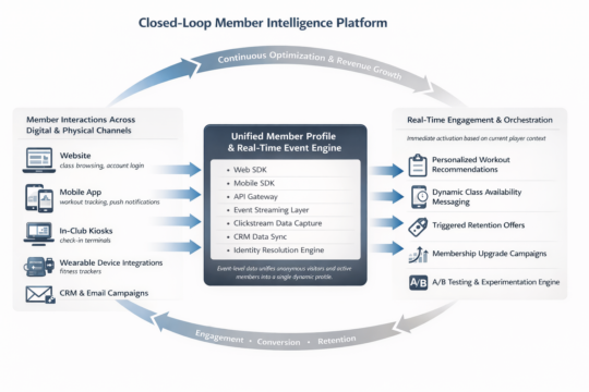
Clear winner for “looks like a human consultant made this at 11:30 p.m. before a board meeting.” The text was incredibly legible. The layout was balanced. The hierarchy made sense. It genuinely looked like something you’d expect in a mid-market SaaS pitch deck.
I even did a reverse image search on some of the icons. No exact matches. That suggests they were generated rather than assembled from some common icon pack. Which is pretty cool.
Claude
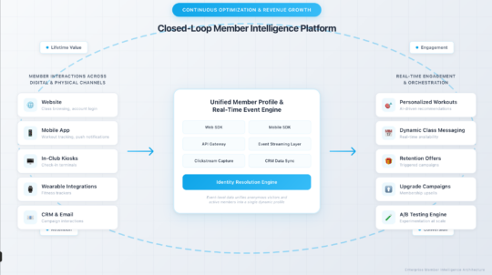
Claude did something interesting. Instead of just giving me a static diagram, it generated a React application that rendered the architecture visually inside its canvas. I should have guessed this is what that nerd would do… in fact I did guess, but whatever.
That has upsides. I can tweak the code. I can modify the layout. I can version control it. That’s appealing to the nerd in me.
But technically it failed the homework assignent. It wasn’t what I asked for. I asked for a diagram image. What I got was a React app that displayed a diagram that I had to screenshot.
That said, I actually liked the aesthetic. It felt a little more “me.” Slightly less textbook. Slightly more product-thinking.
Gemini (Nano Banana)
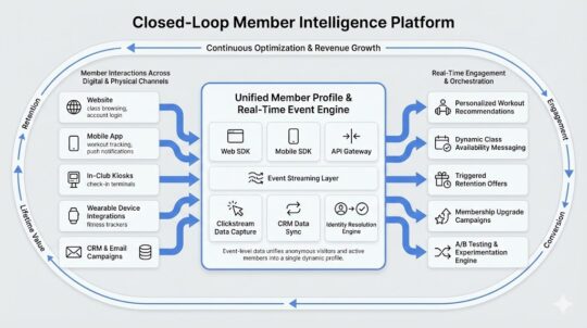
The undisputed champion of 2026 in image generation, nano banana, was actually my least favorite of all of the designs. I think there’s something really weird about the arrows on the outside ring of this diagram. Why are there two arrows between “Engagement” and “Conversion”? Why are they different sizes? I did actually find a couple of exact matches when searching for some of these icons here, so so there might be some assembly on top of generation going here, but I cannot tell because these icons are so universal that it’s likely that that could just be a coincidence.
Midjourney
Ah, Midjourney. My current favorite for keynote frogs.
Completely and utterly useless for generating readable diagrams.
It’s phenomenal at stylized imagery. I’ve tuned it so much over time that it practically knows my aesthetic preferences better than I do. It’s like it’s been trained specifically to make amphibians that align with my personality.
The Omni feature (object permanence) is genuinely impressive. If you’re telling a visual story and need a character to look consistent across multiple scenes, or you’re creating a children’s book to convince your six-year-old that haircuts are not a violation of human rights, it’s fantastic.
But enterprise architecture diagrams? Nope, sucksville.
Wrapping Up
I was pretty sure that nano banana was going to run away with this one. Everyone I know works in banking or finance or medicine has been telling me how great the model is for generating diagrams and process flows. They’ve been raving about how things that were not possible three months ago are now completely durable with this model. It was a little bit of a surprise to see that my personal favorite was good old-fashioned ChatGPT. I think, for my personal use, I’m probably going to use Claude to generate diagrams because they’re a lot easier for me to tweak once they’ve been generated.
That said, I think this experiment showed that when I do this kind of work in the future, I’m just going to load up the same prompt in three different models and just pick the one I like the most. Some of it’s going to be personal tastes; some of it’s going to be how well the model interpreted the prompt, and some of it’s going to be the state of that particular LLM and its model on that given week.
And I’m going to stick to only using Midjourney for generating cute pictures of toads.