I’ve been thinking about all the wrong things when it comes to AI writing code.

Everyone else seems to be too. Job displacement. Security vulnerabilities. The ten-times-faster developer who now bills the same and delivers four times as much. These are real conversations worth having, just not the one I want to have right now.

The one I want to have is about teaching a six-year-old multiplication.

Here’s what I mean. Imagine you’ve been sitting with your kid every night for two weeks trying to explain multiplication. You’ve tried drawing rows of dots. You’ve tried songs (don’t judge me). You’ve tried the “just think of it as groups of things” approach that works for literally every other math concept but, mysteriously, not for your kid. Then one night, something clicks. You found the explanation, YOUR explanation, the one that worked for your actual kid with your actual kid’s brain, and it finally, beautifully, clicks.

Now imagine you could spend a Saturday morning turning that into a small web app. Not a startup. Not a SaaS platform. No login. No backend. No one’s going to hack it (there’s nothing to hack). Just a little thing that walks through multiplication the exact way you figured out it works, step by step, the way you’d explain it. You send it to the WhatsApp group for your kid’s class. Some of those other parents, also quietly losing their minds over multiplication, try it. And it helps.

You just made the world a tiny bit better. That’s it. That’s the whole thing.

Claude Code exists now, and a handful of other tools like it, and the reason I think this matters isn’t productivity. It’s access. The barrier between “I have an idea for something that could help people” and “I have a thing that helps people” used to require knowing how to code, or hiring someone who does, or talking a developer friend into your project over enough beers that their guilt exceeded their better judgment. Now it’s a Saturday morning and a good description of what you want to build.

The internet already has beautiful things in it that were built out of love. Free coding education for kids. Open-source video editors. Someone’s incredibly detailed home-brewing app with no monetization plan whatsoever. Artists making interactive experiences because they wanted to see if they could. These things exist because someone cared more about making the thing than making money from the thing. I think that ratio is about to shift dramatically in favor of the people who just want to make something good.

I’m not saying we should all stop paying for Salesforce (we should probably keep paying for Salesforce, there’s a reason that thing costs what it costs). I’m saying the category of software that was previously not worth building because it wasn’t commercial enough to justify the cost, that category just got a lot more interesting.

What’s in that category? Things like:

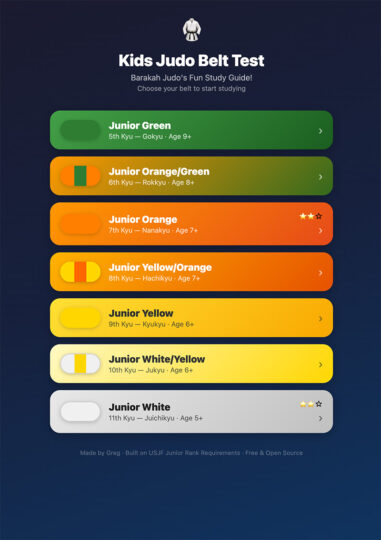
  • An app that helps beginning judo students understand the concepts behind a throw, not just the mechanics, because judo is where I learned confidence and discipline and I want other kids to find that
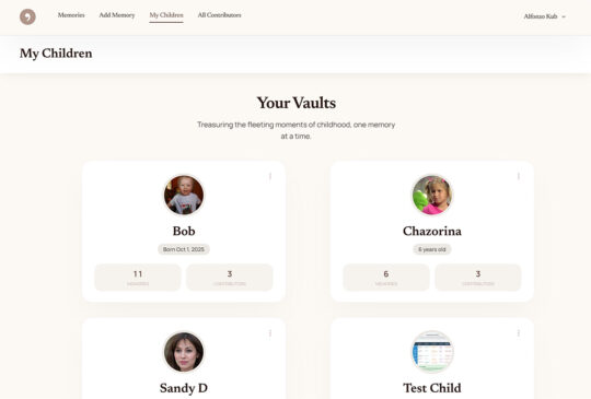
  • A private family memory vault (not Instagram, not Facebook, not anything with an algorithm deciding what matters), just a place where the people who love my son can send photos and stories somewhere safe, for him to open when he’s older (Maybe I’ll turn this into something?)
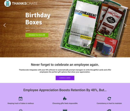
  • A system that reminds companies to send their employees gifts on the days that actually matter to them, because I know from running a company that it fills the cup of the person giving just as much as the person receiving (Thankscrate, if you’re curious, and yes, that one is turning into something real, but that is genuinely not why I built it)

None of those were commercial ideas first. They were just things I cared about.

I think the most interesting software that gets built in the next few years won’t come from developers moving faster. It’ll come from people who previously had no path from “I care about this” to “I built something about this,” and now they do. Parents. Coaches. Teachers. The person in your office who could explain that one complicated process better than anyone and has always secretly wanted to turn it into something.

The stakes are low. The bar to launch is low. The cost is low. The only thing required is that you actually give a damn about what you’re building.

One small caveat before you go off and change the world. If your passion project involves storing the medical records, credit card numbers, or personal information of vulnerable people (childhood leukemia patients, say, or really anyone who has enough going on without also becoming the victim of a data breach), please, for the love of God, do not take that on as a Saturday morning vibe-coding exercise. That is not a passion project, it’s a terrifying lack of judgment and a huge liability. Please hire professionals, follow compliance frameworks, and treat the security of people’s sensitive data with the seriousness it deserves. The whole spirit of what I’m describing here is low stakes, and nothing raises the stakes faster than a database full of information that could ruin someone’s life if it leaks. Build the multiplication app. Build the judo app. Do NOT build the “I’ll just store some PHI real quick” app.

So… What do you give a damn about?

Go build it. I still sometimes have to count on my fingers, but I’m told the app helps.

Previous Article
I help companies turn their technical ideas into reality.

CEO @Sourcetoad and @OnDeck

Founder of Thankscrate and Data and Sons

Author of Herding Cats and Coders

Fan of judo, squash, whiskey, aggressive inline, and temperamental British sports cars.

Leave a Reply

Image generation comparison from February 2026

I spend a lot of time generating images these days for presentations. My typical workflow is fairly scientific: I ask Midjourney to produce a relatively cute image of a frog, a toad, a robot, or some other vaguely anthropomorphic creature doing something related to the slide I’m about to present.

Once I get the image, I expand the background by about 90% so the character ends up in the corner of the slide. That gives me a nice, relatively clean area to drop text on top. Sometimes I use Photoshop to do the expansion. Sometimes Midjourney cooperates. ChatGPT is actually pretty good at this too. Nano Banana is… enthusiastic. It tends to try a little too hard right now.

That’s fun and all. But the more interesting comparison isn’t cute amphibians. It’s boring enterprise diagrams.

Recently I had to generate some architecture visuals for an RFP response. Rather than suffer alone, I decided to turn it into a model comparison experiment.

Below is a slightly simplified (but very real-feeling) prompt I used. The company is fictional. The buzzwords are not:

Create a clean, executive-level architecture diagram titled “Closed-Loop Member Intelligence Platform.”

The layout should be 16:9 and structured left to right with a circular optimization loop surrounding the system.

On the left side, show multiple member touchpoints feeding into the platform:
- Website (class browsing, account login)
- Mobile App (workout tracking, push notifications)
- In-Club Kiosks (check-in terminals)
- Wearable Device Integrations (fitness trackers)

Label this section: “Member Interactions Across Digital & Physical Channels.”

All touchpoints should flow into a large central hub labeled:

“Unified Member Profile & Real-Time Event Engine”

Inside the central hub, include:

- Web SDK
- Mobile SDK
- API Gateway
- Event Streaming Layer
- Clickstream Data Capture
- CRM Data Sync
- Identity Resolution Engine

Include a small sub-caption:
“Event-level data unifies anonymous visitors and active members into a single dynamic profile.”

From the central hub, arrows should flow to a right-side activation layer labeled:

“Real-Time Engagement & Orchestration”

Include these outputs:

- Personalized Workout Recommendations
- Dynamic Class Availability Messaging
- Triggered Retention Offers
- Membership Upgrade Campaigns
- A/B Testing & Experimentation Engine

Surround the entire diagram with a circular arrow labeled:

“Continuous Optimization & Revenue Growth”

Along the circular loop, include metrics:

- Engagement
- Conversion
- Retention
- Lifetime Value

Design style should be modern, minimal, and suitable for an enterprise SaaS presentation.
Use neutral tones with one accent color to indicate data flow.
Avoid clutter.
Make the architecture clear and readable for both technical and executive audiences.

Here are the results.

ChatGPT

Clear winner for “looks like a human consultant made this at 11:30 p.m. before a board meeting.” The text was incredibly legible. The layout was balanced. The hierarchy made sense. It genuinely looked like something you’d expect in a mid-market SaaS pitch deck.

I even did a reverse image search on some of the icons. No exact matches. That suggests they were generated rather than assembled from some common icon pack. Which is pretty cool.

Claude

Claude did something interesting. Instead of just giving me a static diagram, it generated a React application that rendered the architecture visually inside its canvas. I should have guessed this is what that nerd would do… in fact I did guess, but whatever.

That has upsides. I can tweak the code. I can modify the layout. I can version control it. That’s appealing to the nerd in me.

But technically it failed the homework assignent. It wasn’t what I asked for. I asked for a diagram image. What I got was a React app that displayed a diagram that I had to screenshot.

That said, I actually liked the aesthetic. It felt a little more “me.” Slightly less textbook. Slightly more product-thinking.

Gemini (Nano Banana)

The undisputed champion of 2026 in image generation, nano banana, was actually my least favorite of all of the designs. I think there’s something really weird about the arrows on the outside ring of this diagram. Why are there two arrows between “Engagement” and “Conversion”? Why are they different sizes? I did actually find a couple of exact matches when searching for some of these icons here, so so there might be some assembly on top of generation going here, but I cannot tell because these icons are so universal that it’s likely that that could just be a coincidence.

Midjourney

Ah, Midjourney. My current favorite for keynote frogs.

Completely and utterly useless for generating readable diagrams.

It’s phenomenal at stylized imagery. I’ve tuned it so much over time that it practically knows my aesthetic preferences better than I do. It’s like it’s been trained specifically to make amphibians that align with my personality.

The Omni feature (object permanence) is genuinely impressive. If you’re telling a visual story and need a character to look consistent across multiple scenes, or you’re creating a children’s book to convince your six-year-old that haircuts are not a violation of human rights, it’s fantastic.

But enterprise architecture diagrams? Nope, sucksville.

Wrapping Up

I was pretty sure that nano banana was going to run away with this one. Everyone I know works in banking or finance or medicine has been telling me how great the model is for generating diagrams and process flows. They’ve been raving about how things that were not possible three months ago are now completely durable with this model. It was a little bit of a surprise to see that my personal favorite was good old-fashioned ChatGPT. I think, for my personal use, I’m probably going to use Claude to generate diagrams because they’re a lot easier for me to tweak once they’ve been generated.

That said, I think this experiment showed that when I do this kind of work in the future, I’m just going to load up the same prompt in three different models and just pick the one I like the most. Some of it’s going to be personal tastes; some of it’s going to be how well the model interpreted the prompt, and some of it’s going to be the state of that particular LLM and its model on that given week.

And I’m going to stick to only using Midjourney for generating cute pictures of toads.