There has been a lot of hype recently in Tampa Bay about the “Here Comes the Bus” app. This is system that allows parents to see when their kids have gotten on a school bus, and where the bus is. Some parents are concerned that systems like this one could let malicious users, or government agents track their children. So I’m going to give a quick overview of how systems like these work, and why they are not dangerous. We will also look at what parents SHOULD be concerned about.

How it works

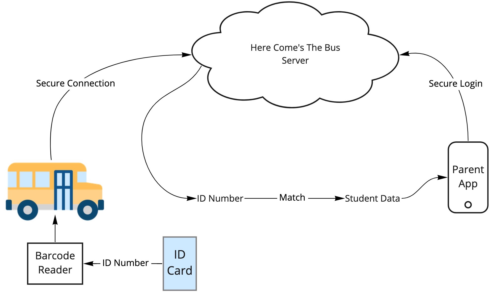
The system is fairly straight forward. Students have either a barcode or a passive RFID chip printed onto their “Bus Pass” – which is just a card they carry around. This card is scanned once the student boards the bus, either with an RFID reader or a barcode scanner (basically the same technology used at grocery stores and clothing shops).

The barcode or the RFID chip carries a simple ID number. This number does not represent the student in any identifiable way – it’s just randomly assigned. The RFID scanner is connected to an internet-enabled device and sends the ID number securely to a server.

Keep in mind, if any data is intercepted up to this point, it is of no use to an attacker. The attacker would at best get a random number that means nothing.

On the other side of the system is the parent’s app. This app is connected to Here Comes The Bus‘ servers, which lets them know that their child is on the bus. The bus also has a GPS tracker on it, which connects to the internet and lets the Here Comes the Bus‘ servers know where the bus is.

That random ID number is then looked up in a database which lets the application know which child has been assigned that ID number. The parent’s device securely requests that information, and it is provided securely down to the app.

It is possible the data coming down to the parent could be intercepted by an attacker. However, as this technology is very secure and is commonly used in almost every piece of software these days (from your health systems to banking apps), it is HIGHLY unlikely.

Could you track kids using their cards?

Some of these bus passes contain a chip, and that sounds scary right? Well, you don’t have to worry too much. These chips are passive RFID chips, the same type of technology that is imprinted in clothing labels to stop theft. Passive means that they need to be picked up by a powered scanner. In order to track a child, you would need to know their ID number (the randomly assigned one), and then set up expensive, high-powered scanners all around town. So it is possible, but there are WAY cheaper and easier ways to track someone. So this seems incredibly unlikely.

Could you track kids if you hacked into the Here Comes the Bus servers?

So the one thing that COULD happen is the Here Comes the Bus’ servers could be hacked. An attacker could break into the database and potentially be able to work out where a child has been, but this does not necessarily mean they will be able to find information on a particular child either. This data is hopefully encrypted, or linked to the school’s secure systems. I can’t speak to how this system has been secured and architected. My best guess is the system was designed with the understanding that this is sensitive data, and great care should be taken over the security. There are also a number of regulations in place that govern the usage and security of student and child data. The Children’s Online Privacy Protection Act of 1998 (COPPA) provides strict regulations regarding a child’s data. The Family Educational Rights and Privacy Act of 1974 (FERPA) gives parents certain rights with respect to their children’s education records. These two regulations will have been taken into account by the developers and the school board when evaluating this software.

Should I be worried about this?

No system is perfect and inherently has its risks, but these risks need to be balanced against the rewards. I think that the safety aspects of this application far outweigh the highly remote possibility of the system being misused. There are WAY easier ways to track people than trying to exploit a system like this.

So what should I be worried about?

There are real threats and issues out there for you to be worried about. Kids download all sorts of things to their devices, and these downloads represent real, actual threats. Malware embedded in games, social media apps, and even downloaded backgrounds can track your exact GPS location, leak your phone number, show inappropriate content, or steal personal information.

Instead of worrying about the government tracking your kids while you send them to a Public school, take a look at your kids’ actual devices. Install something like Norton Security Online and Norton Security for iOS or Android, or Malwarebytes. Also talk to your kids about what apps they’re using, and listen to hear for anything strange about their data usage, or content that is coming up unexpectedly, or unusual phone calls they’re getting. These are indicators of real threats to kids’ information and of valid concern by parents.

Previous ArticleNext Article
I help companies turn their technical ideas into reality.

CEO @Sourcetoad and @OnDeck

Founder of Thankscrate and Data and Sons

Author of Herding Cats and Coders

Fan of judo, squash, whiskey, aggressive inline, and temperamental British sports cars.

Leave a Reply

Image generation comparison from February 2026

I spend a lot of time generating images these days for presentations. My typical workflow is fairly scientific: I ask Midjourney to produce a relatively cute image of a frog, a toad, a robot, or some other vaguely anthropomorphic creature doing something related to the slide I’m about to present.

Once I get the image, I expand the background by about 90% so the character ends up in the corner of the slide. That gives me a nice, relatively clean area to drop text on top. Sometimes I use Photoshop to do the expansion. Sometimes Midjourney cooperates. ChatGPT is actually pretty good at this too. Nano Banana is… enthusiastic. It tends to try a little too hard right now.

That’s fun and all. But the more interesting comparison isn’t cute amphibians. It’s boring enterprise diagrams.

Recently I had to generate some architecture visuals for an RFP response. Rather than suffer alone, I decided to turn it into a model comparison experiment.

Below is a slightly simplified (but very real-feeling) prompt I used. The company is fictional. The buzzwords are not:

Create a clean, executive-level architecture diagram titled “Closed-Loop Member Intelligence Platform.”

The layout should be 16:9 and structured left to right with a circular optimization loop surrounding the system.

On the left side, show multiple member touchpoints feeding into the platform:
- Website (class browsing, account login)
- Mobile App (workout tracking, push notifications)
- In-Club Kiosks (check-in terminals)
- Wearable Device Integrations (fitness trackers)

Label this section: “Member Interactions Across Digital & Physical Channels.”

All touchpoints should flow into a large central hub labeled:

“Unified Member Profile & Real-Time Event Engine”

Inside the central hub, include:

- Web SDK
- Mobile SDK
- API Gateway
- Event Streaming Layer
- Clickstream Data Capture
- CRM Data Sync
- Identity Resolution Engine

Include a small sub-caption:
“Event-level data unifies anonymous visitors and active members into a single dynamic profile.”

From the central hub, arrows should flow to a right-side activation layer labeled:

“Real-Time Engagement & Orchestration”

Include these outputs:

- Personalized Workout Recommendations
- Dynamic Class Availability Messaging
- Triggered Retention Offers
- Membership Upgrade Campaigns
- A/B Testing & Experimentation Engine

Surround the entire diagram with a circular arrow labeled:

“Continuous Optimization & Revenue Growth”

Along the circular loop, include metrics:

- Engagement
- Conversion
- Retention
- Lifetime Value

Design style should be modern, minimal, and suitable for an enterprise SaaS presentation.
Use neutral tones with one accent color to indicate data flow.
Avoid clutter.
Make the architecture clear and readable for both technical and executive audiences.

Here are the results.

ChatGPT

Clear winner for “looks like a human consultant made this at 11:30 p.m. before a board meeting.” The text was incredibly legible. The layout was balanced. The hierarchy made sense. It genuinely looked like something you’d expect in a mid-market SaaS pitch deck.

I even did a reverse image search on some of the icons. No exact matches. That suggests they were generated rather than assembled from some common icon pack. Which is pretty cool.

Claude

Claude did something interesting. Instead of just giving me a static diagram, it generated a React application that rendered the architecture visually inside its canvas. I should have guessed this is what that nerd would do… in fact I did guess, but whatever.

That has upsides. I can tweak the code. I can modify the layout. I can version control it. That’s appealing to the nerd in me.

But technically it failed the homework assignent. It wasn’t what I asked for. I asked for a diagram image. What I got was a React app that displayed a diagram that I had to screenshot.

That said, I actually liked the aesthetic. It felt a little more “me.” Slightly less textbook. Slightly more product-thinking.

Gemini (Nano Banana)

The undisputed champion of 2026 in image generation, nano banana, was actually my least favorite of all of the designs. I think there’s something really weird about the arrows on the outside ring of this diagram. Why are there two arrows between “Engagement” and “Conversion”? Why are they different sizes? I did actually find a couple of exact matches when searching for some of these icons here, so so there might be some assembly on top of generation going here, but I cannot tell because these icons are so universal that it’s likely that that could just be a coincidence.

Midjourney

Ah, Midjourney. My current favorite for keynote frogs.

Completely and utterly useless for generating readable diagrams.

It’s phenomenal at stylized imagery. I’ve tuned it so much over time that it practically knows my aesthetic preferences better than I do. It’s like it’s been trained specifically to make amphibians that align with my personality.

The Omni feature (object permanence) is genuinely impressive. If you’re telling a visual story and need a character to look consistent across multiple scenes, or you’re creating a children’s book to convince your six-year-old that haircuts are not a violation of human rights, it’s fantastic.

But enterprise architecture diagrams? Nope, sucksville.

Wrapping Up

I was pretty sure that nano banana was going to run away with this one. Everyone I know works in banking or finance or medicine has been telling me how great the model is for generating diagrams and process flows. They’ve been raving about how things that were not possible three months ago are now completely durable with this model. It was a little bit of a surprise to see that my personal favorite was good old-fashioned ChatGPT. I think, for my personal use, I’m probably going to use Claude to generate diagrams because they’re a lot easier for me to tweak once they’ve been generated.

That said, I think this experiment showed that when I do this kind of work in the future, I’m just going to load up the same prompt in three different models and just pick the one I like the most. Some of it’s going to be personal tastes; some of it’s going to be how well the model interpreted the prompt, and some of it’s going to be the state of that particular LLM and its model on that given week.

And I’m going to stick to only using Midjourney for generating cute pictures of toads.